 When an unstoppable force meets an unmovable object. This is Microsoft pushing a touch pad UI onto their desktop users. It is pixel bloat and inefficient. If they are going to make something new, it must truly be better than what it replaces.
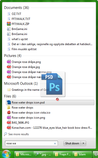
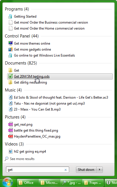 With the Win7 Start Menu I can search for six different results at once
I can drag and drop to any open programs
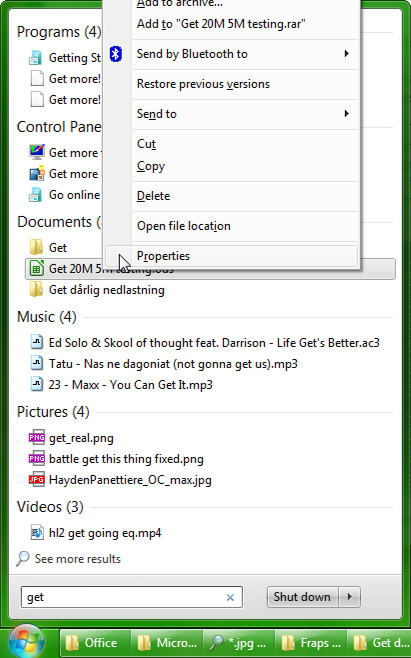
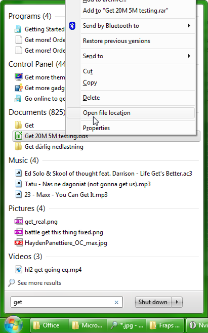
I can view file properties
I can open file location and go directly to its folder
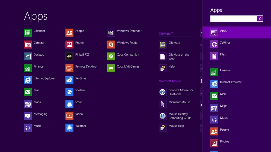
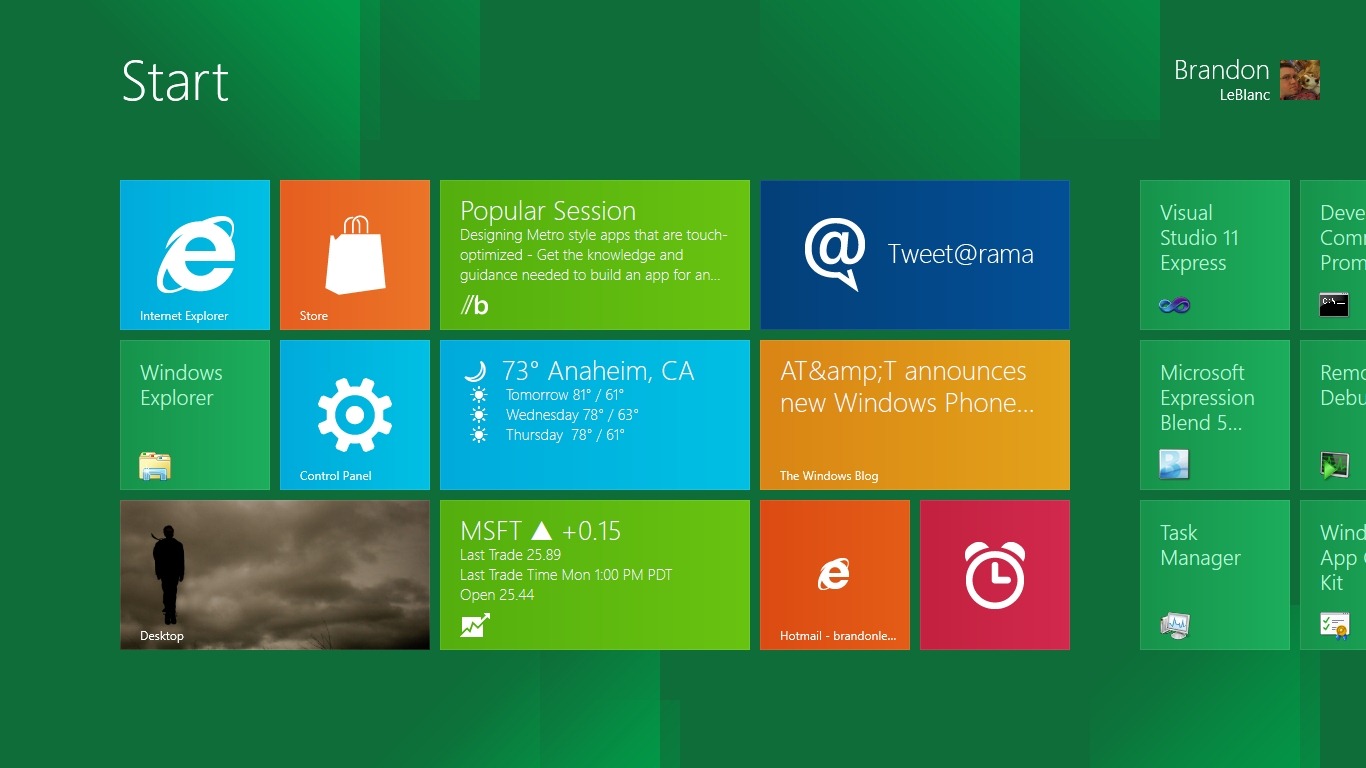
All these usability features is not possible with the Metro UI and its start screen. You can only search for one type at a time, and no drag and drop, properties or open file location. You also have to move the mouse in two turns (lift and drag) if you have a big screen and no crazy high acceleration setting.
Having two 23″ monitors and several applications open and quickly shift between them with task bar. Overclock your PC and running OCCT, IBT, GPUZ, AI suite to monitor temperatures and a text document to note progress. Impossible with the Metro UI.
The classic UI in Windows 7 lets the user grow and learn new ways to organize and be more efficient. The Metro UI will hold people back at smart phone level. I love the windows phone and it will be a huge advantage to have access to file system and desktop programs on a Windows 8 tablet, but the Metro UI has very little to offer desktop users, other than nice animations and bloating away the pixels.
I want the new explorer in Windows 8 so I can minimize the ribbon and use the quick access toolbar, the up button,
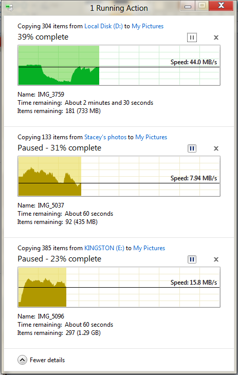
And the unified file transfer dialog.
On my PC, Windows 7 does not always render the desktop composition at 120fps. This make things look jerky since I’m used to 120fps. Fortunately in Windows 8 this is greatly improved.
If you agree, you can nag Microsoft and sign some petitions 😀

