

 he current Win32-based Windows UI graphics subsystem, found in Windows® XP, has been around for nearly 20 years. It's aging and limited, and as a result, user interface development has been somewhat, well, constrained at best.
The Windows Presentation Foundation (WPF), which is built on the .NET Framework, provides new techniques for developing applications, and makes better use of current hardware and technologies. In this article, we'll show you 10 of the most significant advances that make WPF superior to its Win32® forebears. While some of the specific details are likely to change in the final release of WPF, we expect the key concepts to remain the same. For details on how you can start working with WPF today, see the sidebar "Getting the Bits."
10. Advanced Graphics
Over the years, drawing functionality in Windows has improved steadily, though incrementally. Prior to WPF, GDI+ was the pinnacle of 2D graphics in Windows. GDI+ provides fully scalable drawing primitives including Bézier paths, cardinal splines, text, and various shapes. It supports a range of advanced gradient and texture fill styles. And it offers full support for partial transparency and anti-aliasing.
Enhanced Drawing Capabilities Based on just its basic drawing capabilities, WPF looks like a major step forward. It makes considerably better use of the underlying graphics hardware, so it performs much faster than GDI+. It offers as rich a set of drawing features, and brings a few new capabilities to the table. For example, while GDI+ allows arbitrary clip regions to be applied when drawing, WPF takes this feature even further: the opacity mask feature not only lets you clip output to any shape, but also lets you modify the opacity of any arbitrary content.
Figure 1 Repeating Pattern for Use as an Opacity Mask
For example, consider the repeating graphical pattern in Figure 1. You can create a brush, using some Extensible Application Markup Language (XAML) code, that lets you paint with this pattern. (XAML, by the way, is an XML-based language for building trees of .NET objects. It provides a compact and convenient way of creating WPF objects.) The following shows some XAML code that defines such a brush:
<DrawingBrush Viewbox="0,0,1,1" ViewboxUnits="Absolute"
        Viewport="0,0,0.07,0.2" TileMode="Tile">
    <DrawingBrush.Drawing>
        <GeometryDrawing Brush="HorizontalGradient #f000 #0000">
            <GeometryDrawing.Geometry>
                <RectangleGeometry Rect="0,0,1,0.6" />
            </GeometryDrawing.Geometry>
        </GeometryDrawing>
    </DrawingBrush.Drawing>
</DrawingBrush>
This brush can be used as the OpacityMask for any user interface element. Figure 2 shows some yellow text on top of a graduated fill background, using this mask to modulate the opacity.
Figure 2 Text with an Opacity Mask Applied
Fewer Control Constraints These new drawing capabilities are nice to have, but WPF makes some deeper changes. A more profound difference is that drawings are no longer confined to a single control. Consider any Win32-based application—any Windows-based application built using Windows Forms, MFC, Windows Template Library, or Visual Basic®, as well as any application that uses the Win32 API directly.
With Win32, and the associated GDI and GDI+ drawing APIs, each control in the UI owns its part of the window exclusively. Windows are carved up by the controls into a set of disjointed regions that are usually, but not necessarily, rectangular. If you pick any single pixel on a window, there will be exactly one control responsible for drawing that pixel.
The problem with this approach is that it makes certain UI effects impossible. A commonly asked question about Windows Forms is: "How do I draw something so that it appears to be on top of all the controls on the form?" Because each control has exclusive ownership of its part of the screen, there is no straightforward way to achieve this effect. While there are some viable workarounds in the GDI+ environment, these tend not to work if you want to use partially transparent drawing effects. GDI+ offers partial transparency and anti-aliasing for drawing operations, but only when performed within the confines of a single control.
WPF breaks free from this limitation. No single control or UI element has exclusive ownership of any part of the window in a WPF application. You can create partially transparent UI elements, or controls that are not visually constrained to their logical rectangle. For example, it's possible for a control to cast a shadow that falls outside of its logical region.
Take Figure 3, for example. This image shows two buttons. The top button is semi-transparent and the bottom button is visible through the top button. There is also a partially transparent ellipse mixed in. This sort of overlapping design simply isn't possible with Windows Forms or other Win32-based systems. (Windows Forms offers pseudo-transparency, which can work around some of these limitations, but it only works for very basic designs.)
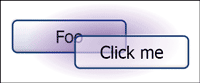
Figure 3 Controls and Transparency
In effect, the whole window becomes a single drawing surface that each of the parts of the UI contribute to. This helps enable another important WPF graphics feature: resolution independence.
Resolution Independence The resolution of flat-panel displays has been gradually increasing. 150 dpi displays are commonplace, 200 dpi displays are readily available, and resolutions are likely to continue increasing. Scalability is crucial to enable the use of high-dpi displays. Without the ability to scale an application's UI, the UI simply becomes smaller as the resolution increases, typically becoming unusable at anything much higher than 150 dpi.
Although GDI+ enables resolution-independent drawing, as did GDI, it is very difficult to write visually scalable applications using these technologies. If you apply a scaling or rotation transform with these APIs, it only affects the drawings. There is no effect on the sizes and positions of controls in the window. Technically, the problem is that while GDI and GDI+ are scalable, USER32 isn't. You can scale drawings, but you can't easily scale the way that a window's space is carved up by controls.
Because WPF composes all of the controls in the window as a single drawing, rather than segregating each control to its own region, it is easy to apply scaling or rotation transformations to the UI as a whole. Thus, since we can scale any WPF UI up or down, WPF applications are effectively resolution-independent. Images remain sharp and clear, as opposed to the blur you would expect from simple bitmap scaling.
Built-In Animation and Video WPF provides built-in support for animation and video, allowing you to build dynamic UIs more easily. Though you can animate parts of your UI with GDI or GDI+, the process requires you to set up a timer and write code to update the display regularly. With WPF, you can instruct the system to animate elements automatically.
Support for animation is comprehensive, letting you animate any part of the user interface. This example shows a rectangle whose width is repeatedly animated from 20 to 200 every five seconds:
<Rectangle Fill="Blue" Height="100">
  <Rectangle.Triggers>
    <EventTrigger
        RoutedEvent="Rectangle.Loaded">
      <BeginStoryboard>
        <Storyboard TargetProperty=
            "(Rectangle.Width)">
          <DoubleAnimation From="20" To="200"
              Duration="0:0:5"
              RepeatBehavior="Forever" />
        </Storyboard>
      </BeginStoryboard>
    </EventTrigger>
  </Rectangle.Triggers>
</Rectangle>
(This example also illustrates another new feature—the Rectangle element uses WPF's object model for representing drawings.)WPF also lets you incorporate video with a single element, as shown here:
<MediaElement Name="myVideo"
    Source="C:\WINDOWS\system32\oobe\images\
        intro.wmv"
    Width="450" Height="400" >
This is a user interface element like any other user interface element. You can put a MediaElement anywhere you might put a button or an ellipse. You can apply all the usual visual operations, such as scaling, rotation, or clipping. It's just a UI element that happens to show video clips.
9. Drawing Object Model
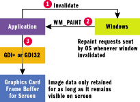
Figure 4 Repainting in Win32
The WPF graphics system offers a completely new programming style. With Win32-based UI technologies, if you want to draw customized graphics, you must write code that responds to repaint requests, drawing the details on demand. This code effectively paints directly to the screen. If that part of the screen becomes obscured by another window and then uncovered, Windows sends a message requesting that this be redrawn. If you want to change the appearance of your graphics, you need to instruct Windows to invalidate the relevant areas of the screen in order to initiate a repaint. Figure 4 illustrates this system.
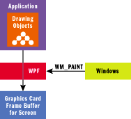
Figure 5 Repainting in WPF
While WPF still supports this model, it offers a simpler alternative. In WPF, you can create objects that represent the drawing primitives you wish to use and add these to your UI. You can use either XAML or traditional application code to do this. Once these objects are in the user interface element tree, they are rendered by WPF—you do not need to write any code to handle repaint requests. (Figure 5 shows this system.) Moreover, when you change a property of such an object, such as the Width property of a Rectangle, the display is updated automatically. In other words, you can use drawing primitives in the same way that you use controls—just create them and set their properties, leaving them to take care of the business of drawing themselves onto the screen.
The code in Figure 6 creates 10 Rectangle elements and adds them to a Window. Whenever the Window receives mouse wheel events, it adjusts the Width of all the Rectangle elements (see Figure 7).
Notice that the OnMouseWheel method does not explicitly trigger any redrawing. In fact, there isn't a repaint or redraw handler in sight. In a Win32-based program, it would be necessary to provide such a handler and to invalidate the window in order to get the display updated. In WPF, this is unnecessary.
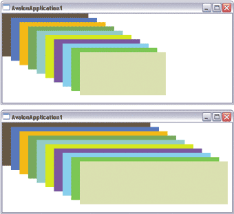
Figure 7 Adjusting Rectangle Width
The drawing object model makes it much easier than before to integrate graphical elements into applications. But good presentation isn't just about graphics—the quality of your textual presentation is also important.
8. Rich Application Text
Text in Windows applications has long fallen short of the text capabilities offered by Web applications. HTML and cascading style sheets (CSS) provide Web applications with a host of text layout and formatting features. Windows applications, on the other hand, have had little support.
Of course, it is possible to display richly formatted text using Win32—after all, Microsoft® Internet Explorer and Microsoft Word are both Windows applications—but the programming task is monumental. Alternatively, you can embed the MSHTML control and use it to display text. However, this technique does not fully integrate document-quality text rendering directly into your application, meaning certain application areas, such as text styles within a button label, can't benefit from MSHTML. Unfortunately, you're left with a sharp contrast between the document display managed by MSHTML and the rest of your application.
WPF makes it easier to integrate richly formatted text into the user interface. Even the simplest text-handling element, the TextBlock control, lets you use any mixture of font style, size, color, and typeface. Here's an example consisting of a single TextBlock element:
<TextBlock FontFamily="Calibri" FontSize="11pt">
Hello, <Bold>world!</Bold>
<Span FontFamily="Old English Text MT"
FontSize="24pt">This</Span>
is a
<Italic>single</Italic>
<Span FontFamily="Consolas" Foreground="Blue">
<<Span Foreground="DarkRed">TextBlock</Span>/>
</Span>
<Hyperlink>element</Hyperlink>.
</TextBlock>
As you can see in Figure 8, even within this one element, we can achieve a wide variety of styles. Compared to the humble Label control in Windows Forms, this is pretty powerful stuff. Although, even if all you want is the plain text that you can get with Label, TextBlock is still very easy to use. To forgo the fancy formatting, you can just give it a simple string to display.
Figure 8 TextBlock with Rich Formatting
For slightly larger volumes of text, WPF offers the TextFlow control, which provides document-like features. For example, you can include numbered or bulleted lists and floating figures. TextFlow offers a feature set similar to HTML, but unlike HTML, it is designed to integrate seamlessly with WPF controls.
WPF removes the hard boundary between document display and other application features, making it easy to build applications with much more advanced use of text and typography. Since the TextFlow element is an integrated part of WPF, you can place this element anywhere in your UI. And you're free to mix user interface elements, for example, placing buttons right in the middle of text (see Figure 9).
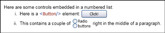
Figure 9 Mixing Controls and Text
Furthermore, WPF offers advanced text layout features for applications that need to display large volumes of text (these are especially useful where text presentation is the primary purpose of the application). For instance, the DocumentViewer control displays text documents, using advanced text layout heuristics to optimize the readability of text for the available space and resolution. This text layout technology incorporates the fruits of extensive research Microsoft has performed regarding on-screen readability.
Getting your text to look right is crucial to building a great-looking application overall. But more important still is making sure that all the parts of your application's visuals appear in the right place at the right size, regardless of how the user may choose to arrange her windows.
7. Adaptable UI Layout
Most application designers don't have the luxury of knowing the size at which their programs will be run. There is enormous variation in screen size from one PC to another. Moreover, some users run applications maximized—filling the entire screen—while others use smaller windows so they can see several applications at once.
This doesn't stop some designers from designing a UI that only works at one size (a practice that, for some reason, is particularly rife on the Web). However, if you want to serve the needs of your users, you should produce a UI with a layout that can adapt itself to the space available. Such adaptability is also useful if you want your application to be accessible and localizable. A sufficiently adaptable UI won't need a redesign to accommodate rendering at a low screen resolution or translation into a language where all the words are twice as long.
WPF offers a powerful toolbox of layout elements that make it easy to build a UI with an adaptable layout. The simple docking and anchoring techniques familiar to Windows Forms developers are available. It is also possible to use a flow-style layout, where UI elements are arranged just as words would be arranged in text: left to right, and then flowing onto the start of the next line once the current line is full. WPF also offers a Grid. This is an extremely powerful layout element which enables grid-like or table-like layouts—these will be familiar to anyone who has abused the HTML table element. Because of its general-purpose applicability, the Grid is probably used more than all the other layout panels put together.
As an example of one simple use, Figure 10 shows the code for a grid with two rows and two columns. Inside the Grid element, the ColumnDefinition and RowDefinition elements define the properties of the columns and rows in the Grid. Each UI element then has a row and column property that designates where it appears in the Grid. Figure 11 shows the results.
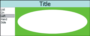
Figure 11 The Rendered Grid
This example also shows that items do not need to be constrained to a single cell in the grid. The Title TextBlock uses the Grid.ColumnSpan property to span both columns. This is how it manages to fill the entire width of the grid.
Additionally, this example illustrates the use of automatic and proportional sizing. The first row's Height has been set to Auto, which tells the grid to make the row exactly high enough to hold that row's contents and no higher. The second row ends up filling the remaining available space. The column widths use a different technique; they have been set to * and 5*. The * syntax indicates that rows or columns should share the available space. The number indicates the proportions used to allot the space. The column with a width of 5* gets five times as much space as the one with *. (This techique is not unlike assigning percentages in HTML tables.) You can also use decimals, such as 1.2*.
Layout elements can be nested, making it possible to produce extremely complex layouts. Moreover, if you need something not available in the built-in layout types, you can easily write new layout element types. While Windows Forms offered significantly better automatic layout facilities than its predecessors (especially in the .NET Framework 2.0), WPF takes UI layout capabilities to a whole new level.
6. Flexible Content Model
Many controls provide placeholders for some kind of application-specific content. Buttons, for example, usually have a label to let the user know what the button is for. Some controls have several placeholders: tab controls allow a caption to be placed in each tab, as well as content in the tab body. Most UI systems, however, are somewhat restrictive about the content that can be used as captions and labels. Often, only plain text is allowed. In some cases, a control will go as far as letting you display a bitmap alongside or in place of the text.
WPF offers a radically different approach. Instead, its content model allows any content to be used liberally in such a placeholder. For example, the Button control doesn't require you to supply text—you can put anything you want in there. You could put a bitmap, a drawing, or even a layout panel containing several drawings, as shown in this code:
<Button>
    <StackPanel Orientation="Horizontal">
        <Ellipse Fill="Navy" Stroke="Yellow"
            Width="30" Height="20" />
        <TextBlock VerticalAlignment="Center">
            You can put anything in a button!
        </TextBlock>
    </StackPanel>
</Button>
It's even technically possible to use a menu or a textbox as the content of a Button, although that would be a crime against usability. Figure 12 shows some of the possibilities, although this particular instance illustrates some poor choices.
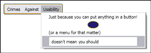
Figure 12 Abusing the Content Model
Even though this example is not useful, it does illustrate the flexibility of the content model. Its lack of restrictions enables a host of visual design possibilities that, in the past, would have typically required owner-draw code to be written. This new model provides a great deal of power for visual designers—designers can now prototype designs that once would have required input from developers.
5. Lookless Controls
While the content model lets you customize the contents of controls, WPF's lookless approach to controls enables you to customize a control's entire appearance. This sort of task has traditionally required a custom control to be written, because appearance has always been an integral part of the control. In many UI technologies, the very definition of a control is essentially a visible component. But this is not the case in WPF.
WPF takes the radical step of disassociating the appearance from the control. Most WPF controls are lookless, meaning they just provide behavior. The appearance is supplied separately in the form of a template. A control typically provides a built-in template so it has a default appearance. Better yet, it can supply several templates—perhaps one to match the XP Luna theme, another to blend in with Aero, and a third to match the classic Windows 2000 theme. However, the template that defines a control's default appearance can be replaced in order to change the look of the control.
Figure 13 shows an example of replacing the template of a button. The ContentPresenter element is a placeholder that tells WPF where the button's content should be added into the results (and without this, the button's caption wouldn't appear).
When developing a reusable UI element, you need to think carefully about what type of element it is. If you are used to using Windows Forms, you might be naturally inclined to make all visible objects derive from Control. This, however, is often the wrong choice in WPF. If the purpose of your component is to provide a particular interaction—say, the checkable behavior of a Button or the display and selection behavior of a ListBox—then it should be a control. But if its job is to provide a particular visual appearance with no intrinsic behavior, it should not be a control; instead, it should derive from FrameworkElement, like Ellipse and Rectangle do by way of the Shape class.
Controls have behavior and (usually) a replaceable appearance. This makes WPF controls much more flexible than Windows Forms or Win32 UI components—you can change anything about how the control looks without losing any of its functionality.
4. Data-Driven UI
We've already discussed how the WPF content model allows you to place whatever content you want inside certain kinds of controls. In our example, we simply embedded some fixed content. But hard-coding content is pretty dull. Wouldn't it be much more exciting to create an application that dynamically changes what it displays.
It turns out you can do this, too. Controls that support the WPF content model allow you to use anything as the content, even non-UI objects. That means you can write the sort of code shown in Figure 14. This may seem like a peculiar thing to do; you probably expect a button's content to consist of either text or some UI elements. But in this code, we are setting the button to be an instance of a custom class.
Admittedly, the default behavior isn't terribly useful, as shown in Figure 15. WPF didn't know what to do with the object, so it just called ToString. This may not feel like progress. However, even though WPF doesn't know what to do with this object by default, we can tell it what to do by supplying a data template.
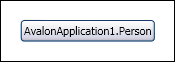
Figure 15
A data template is essentially a set of instructions that tells WPF how to display an object. You can explicitly assign a data template in a particular context. For example, in this case you could set the Button's ContentTemplate property to use the Name property from the Person object, as follows:
<Button x:Name="myButton">
    <Button.ContentTemplate>
        <DataTemplate>
            <TextBlock Text="{Binding Name}" />
        </DataTemplate>
    </Button.ContentTemplate>
</Button>
You don't have to set the data template on a particular control. If you prefer, you can associate a data template with a particular type, indicating that WPF should use the specified template whenever it encounters that particular type as content. This is putting the template into the resources section (see Figure 16). Note that this template is a little more ambitious. It displays all of the information from the source data, as shown in Figure 17.
Anything in the window that uses a Person object as its content will pick up this data template by default. If you were to set the contents of a listbox to an array of Person objects, each line of the list would use this template.
Figure 17 Richer Data Template
Data templates act as a bridge between objects and the UI. They allow designers great flexibility to manage the way data is presented. Achieving the same effects in Win32-based technologies requires a great deal of developer effort.
3. Consistent Styles
If you've ever used a word processor, you're probably familiar with the concept of styles. A style is a set of properties that can be applied to some part of your document in order to get a particular appearance. Styles in WPF are very similar, but can be applied to any element in a user interface, not just to parts of a document. Moreover, a WPF style can be used to set any property. For example, you can create a style that sets the Maximum property of a Slider control to 200.
Although styles can be used to set any property, the usual reason for using styles is to ensure visual consistency across your application. If you want your application to convey an old-world look, you can create a style to consistently apply the appropriate properties. This code, for instance, defines a style called oldeWorlde that sets the font to the Old English typeface:
<Window.Resources>
    <Style x:Key="oldeWorlde">
        <Setter Property="Control.FontFamily"
            Value="Old English Text MT" />
        <Setter Property="Control.FontSize" Value="18" />
    </Style>
</Window.Resources>
This style can then be applied to any control you like:
<Button Style="{StaticResource oldeWorlde}">Click me!</Button>
The oldeWorlde style is a named style and will only be applied to controls that explicitly request it in their Style property. It is also possible to define a style that will be applied by default to a designated type of control. The following style will automatically apply to all buttons in a window:
<Window.Resources>
    <!-- all Buttons get this style -->
    <Style TargetType="{x:Type Button}">
    <Setter Property="Control.FontFamily"
        Value="Old English Text MT" />
    <Setter Property="Control.FontSize" Value="18" />
    <Setter Property="Background"
        Value="VerticalGradient Red Black" />
    <Setter Property="Foreground"
        Value="VerticalGradient Yellow Orange" />
    </Style>
</Window.Resources>
...
<!-- no need to set the style manually -->
<Button>Click me!</Button>
Notice that styles are really just lists of properties and values. This means that styles can be used to apply templates—after all, Template is just another property. This provides an easy way to change how a particular control looks throughout the entire window or application. For example, earlier we defined a custom template for a button. In practice, we would probably want to apply that template to more than just one button—our application would look pretty odd with one customized button set among numerous standard buttons. With a style, we can apply the template to all of our buttons, as shown in Figure 18.
This will cause all of the buttons in the window to use this custom template. To change all buttons in all windows, just put the style inside the application-level resources. When you create a WPF project in Visual Studio® 2005, the project template includes a MyApp.xaml file, which contains an Application.Resources section. Any styles you define in this section will be applied to all the windows in your application.
Styles provide a useful mechanism for managing the look of an application independently of its behavior and structure. This separation allows developers to get on with the business of defining the application's behavior, while designers get on with the business of making it look good.
2. Triggers
A trigger is a declarative mechanism that specifies how a control should respond to certain stimuli. Triggers can be declared inside either styles or templates. For example, you could use a trigger to indicate that buttons should always turn green when the mouse is over them:
<Style TargetType="{x:Type Button}">
    <Style.Triggers>
    <Trigger Property="IsMouseOver" Value="True">
        <Setter Property="Background" Value="Green" />
    </Trigger>
    </Style.Triggers>
</Style>
Triggers can also be used to fire animations. For example, you might want a button to fade to a different color while the mouse hovers over it. Animations are different in nature from properties in that they are temporal. While we can set a property to a value, we cannot set an animation to a value—instead, animations are set to start and stop. So animation triggers are event-driven, rather than property-driven.
Figure 19 illustrates how you can use EventTrigger elements to launch animations. This example indicates that when the Mouse.MouseEnter event occurs, the Opacity property must be animated from its current value to the value 1. Similarly, when the Mouse.MouseLeave event occurs, the property is animated from its current value back down to 0.5.
Triggers are an important part of the declarative approach of WPF. This is yet another feature that puts more power in the hands of designers, allowing them to design a UI that responds to actions without first needing code from developers.
1. Declarative Programming
Perhaps the most striking architectural theme in WPF is the use of declarative programming. In declarative programming, emphasis is placed on "what" rather than "how". You declare what you want the system to do, rather than listing the set of operations it must execute in order to achieve this goal. SQL is the canonical example—you construct SQL queries that declare what information you want to retrieve; it's up to the database to figure out how to execute that query.
We've already shown you a few examples that rely on the declarative approach. To provide custom graphics, you can create objects that represent our drawings and WPF then handles the process of rendering these drawings to the screen. These include updating the screen when properties are changed. Likewise, we explained how you can create objects that declare how to animate parts of the UI, and WPF will then perform the actual animation. You've also seen how the layout elements can be used to declare how the UI should be arranged—as opposed to positioning the elements by hand or writing code to determine how they are placed and sized.
There are numerous benefits to a declarative style. Foremost is that it usually results in simpler programs that are easier to read. Code that simply declares what needs to be done is usually a lot shorter than code that performs the actual work. Consider the Grid example shown earlier, which started with the row and column definitions, as shown here:
<Grid.ColumnDefintions>
    <ColumnDefinition Width="*" />
    <ColumnDefinition Width="5*" />
</Grid.ColumnDefintions>

<Grid.RowDefintions>
    <RowDefinition Height="Auto" />
    <RowDefinition Height="*" />
</Grid.RowDefintions>
This is a compact expression of our layout requirements. It tells the Grid element that we require two rows and two columns. It says that the columns should be sized proportionally, with the second column getting five times as much of the total available width as the first column. As for the rows, it tells the grid to pick the height for the first row automatically based on its contents and to make the second row fill all the remaining available space. Imagine how much code this would require if you were to write this manually.It's usually easier to work out what declarative code is trying to do because it explicitly states its intent. Thus, there is no need for maintenance developers to expend a lot of effort trying to infer the intent of the code. Declarative code also enables design tools to do a much better job. A design tool knows what effect you are trying to achieve because you explicitly state your intent. In addition, with declarative programming, the framework is allowed latitude in how it performs the work. This can potentially enable significant optimizations.
Since WPF allows many aspects of a UI's behavior to be defined declaratively, it is fairly straightforward to express these behaviors in XAML. Even though layout and animation are aspects of an application's run-time behavior, you can define these behaviors declaratively with XAML, ultimately providing this power to designers, even if they're not programmers.
Where Are We?
WPF is a radical departure from the established way of building Windows-based apps. It offers significant advances in graphical capabilities and has a huge impact on how application UIs are built. The drawing object model and text handling capabilities make it much easier to exploit the visual potential offered by modern computers. Layout services allow designers to build applications that arrange the content in a way that adapts to the user's requirements. The content model provides great freedom of where we can make use of the textual and graphic facilities. The separation of design and code enabled by lookless controls, styles, data templates, and triggers allows designers to remain in control of an application's appearance while developers maintain control of its behavior. And the declarative programming that runs through all of these facilities reduces the amount of work you have to do to build great apps.